Each month we will be going on a voyeuristic excursion through some of the finest artwork to grace record sleeves. Although of course a purely subjective exercise, we here at 909 believe that a record sleeve is an absolutely critical part of the final package and therefore see it fit to investigate the bravest, slickest, goofiest and oddest sleeves out there. This month, considering two of our 909 crew are going all Lobster Theremin in Cape Verde, 909 resident workhorse Rory Tanner has stepped up for duty.
:format(jpeg):mode_rgb():quality(90)/discogs-images/R-794073-1328450348.jpeg.jpg)
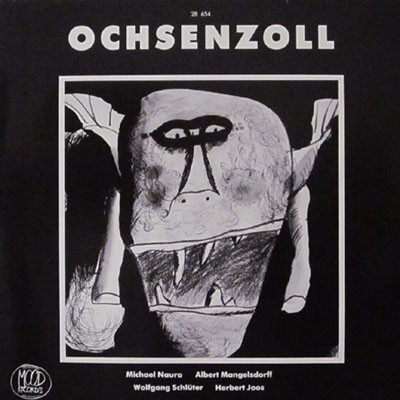
Michael Naura, Albert Mangelsdorff, Wolfgang Schlüter, Herbot Joos- Ochsenzoll
How fucking mental is this?!! It looks like something from Roald Dahl’s nightmares. An absurdist and accurate snapshot of the anxious and decrepit sound of its contents. I love its amateurish sheen and, combined with its asymmetry, makes for a really rogue and morose record sleeve. I love the title as well, I’ve not a clue what Ochsenzoll means but it looks wicked with that picture.
:format(jpeg):mode_rgb():quality(90)/discogs-images/R-9169051-1475985775-5136.jpeg.jpg)
Maricopa- This Was Years Ago
Man like Maricopa is repping the Surrealist imagery in 2017, which i rate a lot. To me, this album cover kinda represents what I imagine Dali would do to Drake’s Nothing Was The Same cover art. It’s obviously completely illogical and incomprehensible, but the clue is in the name surrealism, innit. A beautifully painted and supremely interesting piece.
:format(jpeg):mode_rgb():quality(90)/discogs-images/R-9686730-1484762637-3391.jpeg.jpg)
Young Marco- Selectors 002
Being the massive fan boy I am, I could gush about Young Marco all day. Aside from the absolutely amazing compilation of music within (Objects in Mirrors and 2000 FA especially, I mean holy shit…) this artwork is stone-cold killer. Minimal, broad and colourful; I find that it has a distinct oriental resonance. I think it was painted by Orpheu The Wizard as well, which is cool as Marco has kept the whole project within the Dekmantel microcosm. One of my new favourite records in my collection, particularly so because of this artwork.
:format(jpeg):mode_rgb():quality(90)/discogs-images/R-6011593-1455791406-8955.jpeg.jpg)
Mind Fair- Take Me To The Bridge
Don’t even really know where to begin here… sorry not sorry for the alliteration but it is carefully constructed chaos. I see a drum kit, I see some grainy images of traffic, I see like a Lichtenstein-esque painting at the back. There’s so much going on and none of it makes sense but since when was art about making sense? It is all kinda merged together by that effect that you see in shitty 90’s music videos as well. I love it! Looking at all of my selections so far, they have all been proper weird… realised my taste in cover art is eccentric at best, or maybe I’m just losing my marbles. One look at all these and people would think I’ve been groovin’ with Kesey and the Pranksters or something.
:format(jpeg):mode_rgb():quality(90)/discogs-images/R-99754-1446505961-9603.jpeg.jpg)
Cyber People- Void Vision
Last but by no means least is this offering from Cyber People. A peculiar and confused litter of things going on in this one. It’s funny how it is completely bonkers and seemingly nebulous, yet its structure is regimented in a way that I’ve noticed is rife in loads of 80’s artwork. For example, its structure is eerily similar to Prince’s I Would Die 4 U, seriously, check it. I don’t have much to say on the whole sacrificial upside-down head person in the middle , but I love the juxtaposition of those weird, ancient symbols being inside the grids, for me symbolising an effective merger of the old and the new. I think this is reminiscent imagery of the retro and futurist mesh that constitutes italo, and I love a bit of imagery, me. Huge tip for the contents as well, as it is as brashly ostentatious as italo can get, and is more 80’s than Sonny Crockett’s white suit. Literally cannot stop listening to the slow version; that emotive, cosmic and sluggish italo is the sound I’ve been looking for my whole life.